social accessibility
I used to think that social accessibility was restricted to the few tools and features that social platforms provided, such as the ability to add alt text to images. My knowledge of accessible social media practices expanded considerably when working on a documentary about Helen Keller for the PBS docuseries American Masters. We were charged with creating a fully accessible show and marketing campaign, guaranteeing an inclusive experience for all audiences.
In the spirit of “nothing about us without us,” the team worked closely with a panel of consultants from the disability community. With much research and consultation, I quickly learned a variety of methods—many simple and some more complex—to address the needs of the more than one in four American adults who live with a disability (one in six worldwide).
Below are tips on how to ensure your social content is accessible for all audiences. Simply put, we can’t be inclusive without also being accessible.
Download my complimentary tip sheet.
-
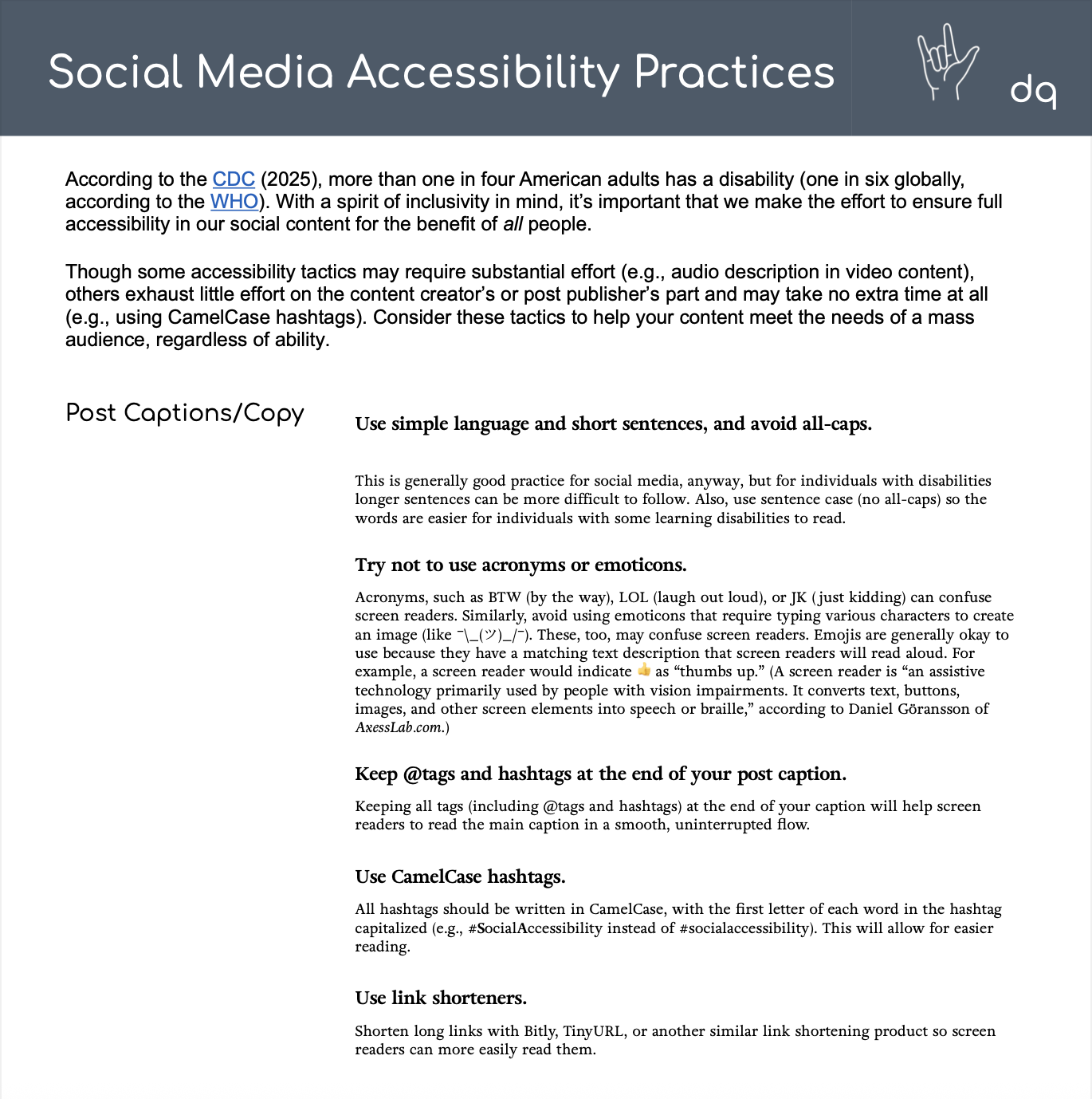
Use simple language and short sentences, and avoid all-caps. This is generally good practice for social media, anyway, but for individuals with disabilities longer sentences can be more difficult to follow. Also, use sentence case (no all-caps) so the words are easier for individuals with some learning disabilities to read.
-
Try not to use acronyms or emoticons. Acronyms, such as BTW (by the way), LOL (laugh out loud), or JK (just kidding) can confuse screen readers. Similarly, avoid using emoticons that require typing various characters to create an image (like \_(ツ)_/). These, too, may confuse screen readers. Emojis are generally okay to use because they have a matching text description that screen readers will read aloud. For example, a screen reader would indicate 👍️ as “thumbs up.” (A screen reader is “an assistive technology primarily used by people with vision impairments. It converts text, buttons, images, and other screen elements into speech or braille,” according to Daniel Göransson of AxessLab.com.)
-
Keep @tags and hashtags at the end of your post caption. Keeping all tags (including @tags and hashtags) at the end of your caption will help screen readers to read the main caption in a smooth, uninterrupted flow.
-
Use CamelCase hashtags. All hashtags should be written in CamelCase, with the first letter of each word in the hashtag capitalized (e.g., #SocialAccessibility instead of #socialaccessibility). This will allow for easier reading.
-
Use link shorteners. Shorten long links with Bitly, TinyURL, or another similar link shortening product so screen readers can more easily read them.
-
Add alt text to all images. Alt text (or alt tags) is a brief description of an image. Screen readers will read the description to individuals with visual impairments so they can visualize the image. Most social media platforms, like Facebook, Instagram, X, and LinkedIn include the option to add this text, some with character limits. Use this resource to learn how to do it.
-
Write image descriptions in your copy. Image descriptions may offer more detail to what’s depicted in the photo/graphic or video than alt text. This can be done in the post caption. Indicating “[PIC]” or “[VID]” helps to identify the content type. Here’s an example. When writing an image description, consider the key points the image is trying to convey and where the eye is drawn, but don’t be overly descriptive as it can be cumbersome for some people as the long description is read by a screen reader.
-
Keep overlaid text on images minimal or avoid altogether. Text that’s overlaid on images may not be identified by screen readers. If an image must have text on it, repeat the same text in the post caption.
-
When using text on images, use sans-serif fonts and minimal italics and underlining. If you do have text overlaid on an image, be sure to use a simple sans-serif font (nothing ornate) and minimal italics and underlining so the text is more easily legible.
-
Use high-contrast colors between text and background images. Any graphic with overlaid text should feature high-contrast colors between the text and the background image so the text is more easily visible for individuals with visual impairments. Here’s an example. It’s also a good idea to include sufficient spacing between groups of text.
-
Add captions to each of your videos. Captions should be included with all videos. Not only do they benefit the 85% of individuals on Facebook who consume video with the sound turned off, but they will benefit individuals with hearing impairments across all platforms. Be sure to include both dialogue as well as music and SFX cues. It may be preferable to “burn in” the captions rather than upload an .SRT file so the captions appear automatically and don’t require the user to turn them on. Here’s an example of a video with burned-in captions. (Note that screen readers will read closed captions, but not burned-in captions. Use your best judgement given the pros and cons of the two formats.)
-
Include a transcript in your video post caption. Some individuals with disabilities can benefit from a full transcript of a posted video, which screen readers will read aloud to them. Consider posting the full dialogue and graphic and sound cues in the post caption, like this.
-
Use audio description. When possible, videos should include audio description for individuals with visual impairments. Audio description is an audio track overlaid on a video. It includes the sound of a voice describing the video’s actions and providing context for visual information. Here’s an example of a video that uses audio description.
-
Be conscious of your GIFs. Animated GIFs that include flickering and flashing elements can make it difficult for some people with cognitive or learning disabilities to focus. They may even cause seizures for some people. Ensure your GIFs flash no more than three times per second and run for less than five seconds.
-
Include a website link and means of contacting your organization in the “About” section or bio. “About” sections or bios of social media accounts should include a website link and means of contacting the organization/company in the event a user needs to reach it.
The image description under the caption illustrates the graphic’s contents for people who are blind or with low vision. The text on the graphic is repeated in the caption, which can be read by a screen reader, an assistive technology tool commonly used by some people with disabilities.
All tags are placed at the end of the caption so as not to interrupt the flow of the caption when read by a screen reader. CamelCase hashtags are also used for improved legibility.